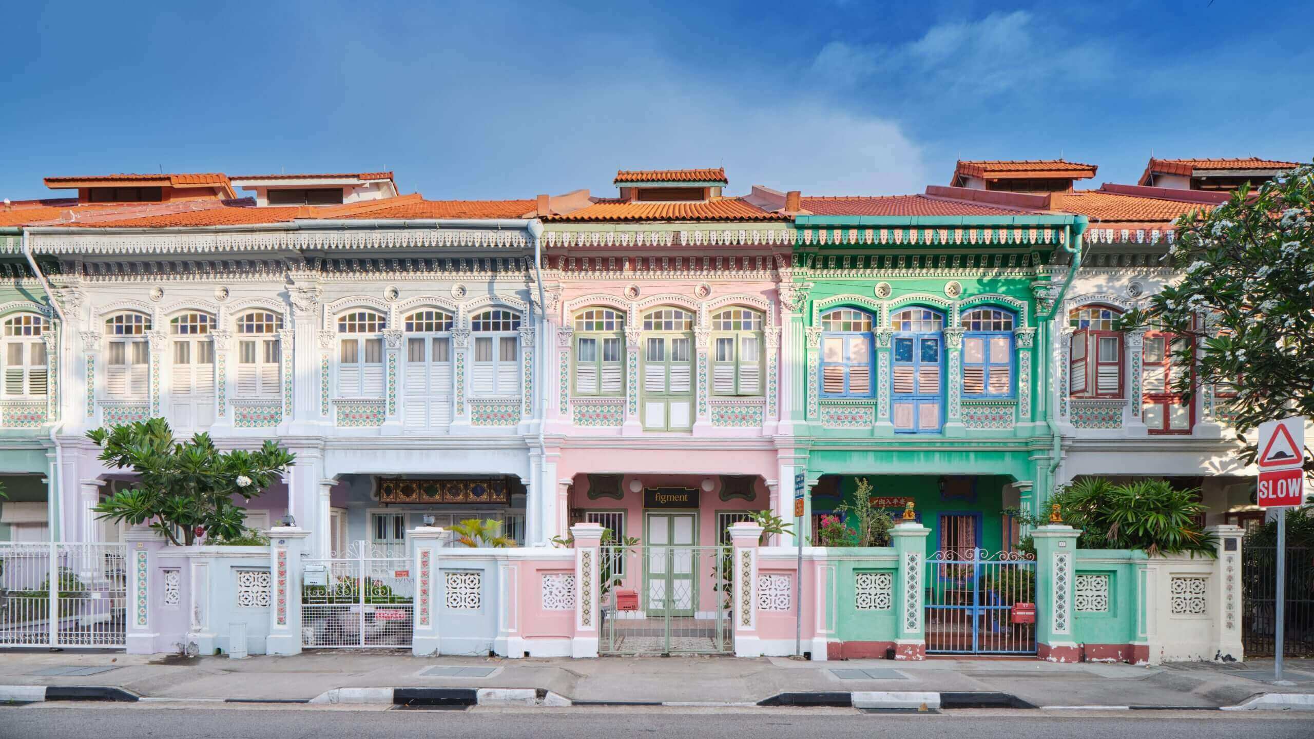
Sign Language: Singapore’s Graphic Vernacular in Jalan Besar
Design researcher Vikas Kailankaje retraces Singapore’s industrial past through the traditional shop signs that still line the footways of the Jalan Besar area.
Guided walks are an essential part of Vikas’ teaching and research practice—these carefully planned ‘performances’, as he refers to them, are several hours long and criss-cross different neighbourhoods and urban scenes, allowing Vikas to tell layered stories of Singapore’s material and visual culture to his students. Here, he discusses some of the unique historical signage that graces the facades of shophouses and other buildings in the Jalan Besar area.
Walking the streets of central Singapore today, it is hard to imagine a time when its commercial establishments were graced by signage that bore the mark of artisans. These handpainted or hand-carved signs were commonplace until the 1980s when new production methods employing vinyl, plastics and metals won favour among sign-makers and business owners.
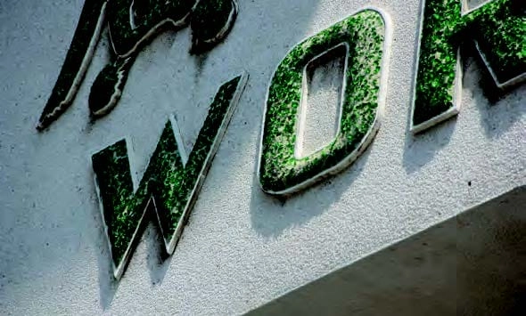
If you have an afternoon to spare, however, you can still uncover the last traces of Singapore’s industrial past and decades-old businesses through shop signs lining the footways of the Bendemeer and Jalan Besar neighbourhoods. Tucked amidst the 1970s flats, shophouses and industrial buildings are old signs belonging to small to medium enterprises that date as far back as the 1920s. They exhibit a variety of visual styles, although “engineered” letterforms—especially for text in English—dominate this survey. They are outlined much like a technical drawing before they are being painted or carved. The result are letters that echo familiar industrial forms, such as a “U” in the shape of a sanitary pipe or a “W” as a piece of bent wire.
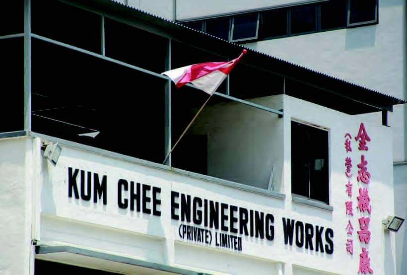
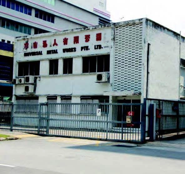
We start at Jalan Lembah Kallang, a rapidly-changing neighbourhood where multi-storey commercial and industrial complexes have replaced much of the low to medium-rise buildings built before the 1980s. As your eyes dance around the street of white or pastel-hued buildings graced by signs in blockish letterforms, look out for the compressed English letterforms of Kum Chee Engineering Works [6] and the squarish Chinese characters of “宇宙私人有限公司” (Universal Metal Works) [7]. They harmonise very well with the utilitarian appearance of the buildings and details such as rectilinear ventilation blocks.
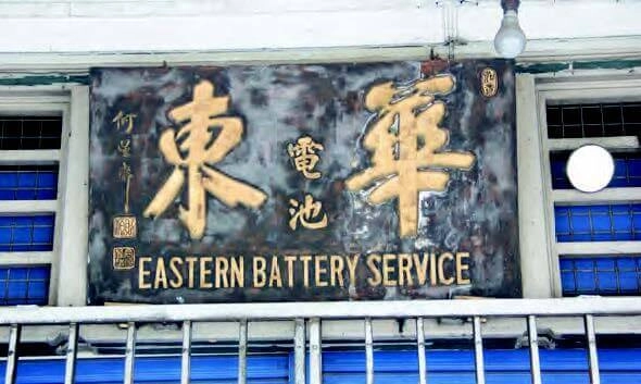
Along Lavender Street are two shophouses that are a reminder of the area’s connection to our motoring past. At both places, the signs of interest face the five-foot-way and are slightly obscured by relatively newer plastic or metal signs that face the street. Eastern Battery Service [8] has an interesting combination of a calligraphic sign bearing the hand of master calligrapher He Xing Zhai (何星斋) and squarish Chinese characters nailed to the ventilation grilles. According to calligraphy enthusiasts, his calligraphy can be found on many signs both in Malaysia and Singapore. Foodies may be heartened to know that his fluid strokes also grace the carved signboards at Swee Choon Tim Sum (191 Jalan Besar).
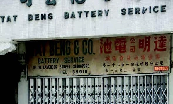
Next, Tat Beng Battery Service’s [9] sign presents a well-balanced composition peppered with some delightful touches. It is split down the middle with both of the English and Chinese text sharing equal importance—a marked departure from convention. As you scan each line, two details stand out: the little twirl on the ampersand (&) and the inclusion of both an address block and a phone number. One can also hazard a guess to the age of this sign: the Chinese lettering (which reads right to left) and the five-digit phone number strongly hint at the 1960s.
Turning off Lavender Street into Cavan Road brings us face-toface with the Art Deco façade of Kwong Soon Engineering Co. [10]. Founded in 1926, this marine engineering company has a resplendent plaster relief sign that runs along its façade. As you walk around it, notice how the broken glass shards embedded in the plaster relief catch the light. There are more such signs around Jalan Besar. For a comparison, head over to Waterloo Street to view the frontage of the South East Asia Hotel (opened in 1953). Unlike timber signboards, which age poorly in our hot and humid conditions, these signs appear less weather-beaten and have retained much of their lustre.
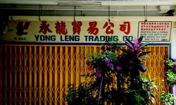
Two streets away, King George’s Avenue is home to a bevy of gems, including Yong Leng Trading Co. [11], which has graceful and neatly arranged brush lettering listing their products (in English and Chinese) down the right flank of its shop sign. The sign also has a hand-painted image of a hydraulic seal. As you walk around King George’s Avenue and Jalan Berseh, you will similarly notice a plethora of hand-painted images of various hardware, ranging from screws to pumps!
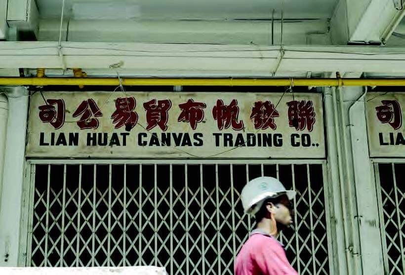
Finally, Lian Huat Canvas Trading Co. [12] sits alongside a row of shops signs that have a similar style which used to be ubiquitous: red Chinese brush lettering with a “drop shadow” effect, sitting atop blue “engineered” English lettering that are spaced and at times stretched to fit the width of sign. Each sign in turn fits the width of an atypical 1970s HDB shop lot—even if each business occupies multiple lots.
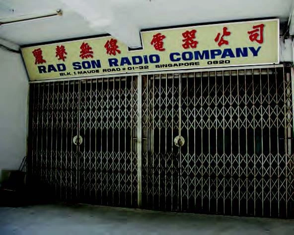
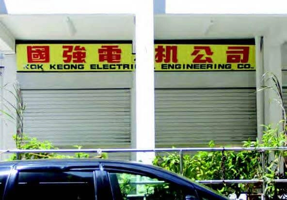
Across the street are two electrical shops at the foot of Block 1, Maude Road. Rad Son Radio Company [13] and Kok Keong Electrical Engineering Co. [14] both have room for wide letterforms because their signs span the width of two shop lots. Kok Keong’s sign is striking as the composition is taut—note how the English text is pulled across the width of the sign while the squarish Chinese characters leave little room along the height of the sign. The signs do make an impression but they are also hard to read from a distance!
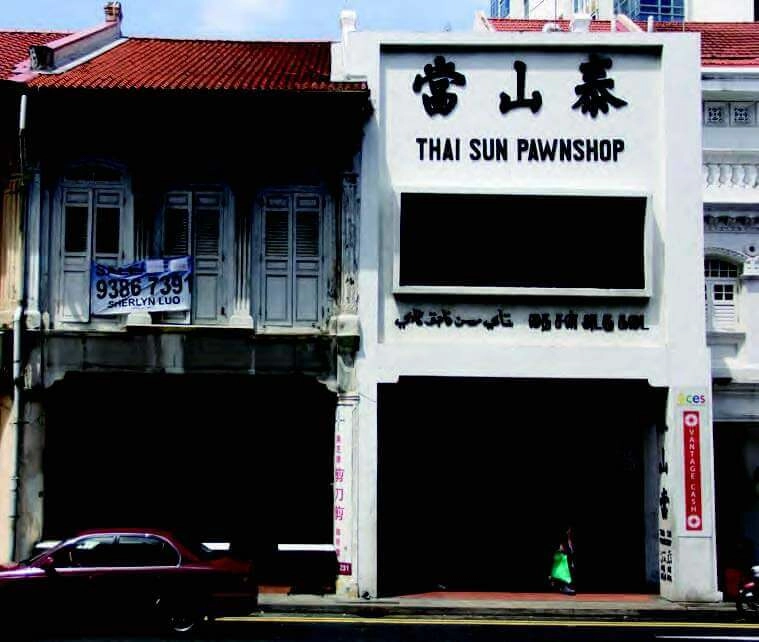
Amidst the many other shop signs along Jalan Besar, take a second look at these two. The first, located in a post-war shophouse, is Thai Sun Pawnshop [15] with its quadrilingual sign rendered in plaster relief and painted in a black-and-white colour scheme. As is the case with many bilingual and multilingual signs that predate the 1970s, the Chinese letters are read from right to left and Jawi characters (before written Malay was Romanised) appear alongside Tamil characters.
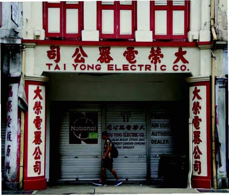
Further down the street, we have Tai Yong Electric Co. [16], one of a few surviving examples of electrical trades that employed signs rendered in plasterwork. Tai Yong’s sign has to be appreciated from across the street. The shop’s name “大荣电器公司” is repeated thrice and has oomph: across the fascia (signboards that are affixed above a shopfront) atop the five-footway and the two columns facing the street. Although the shophouse appears vacant, Tai Yong has merely moved next door.
It is rare that a shop’s sign lives on even if the business has relocated. While plaster relief signs gracing the walls and columns of shophouses may get preserved, fascia signboards often disappear along with the businesses when they close or move out. The longevity of a sign is tied to the state of its business. And the increasing rarity of these artisan-made signs in Singapore is also a sign of how the city’s design scene has evolved with the times.
Vikas Kailankaje is a lecturer in Design Communications at LASALLE College of the Arts and founder of Studio VBK. With a focus on information and graphic design, the Singapore-based studio has worked with institutions, non-profits, publishers and corporate clients since 2011.
Photos by Vishesh Wanvari and Mark de Winne
Similar Posts
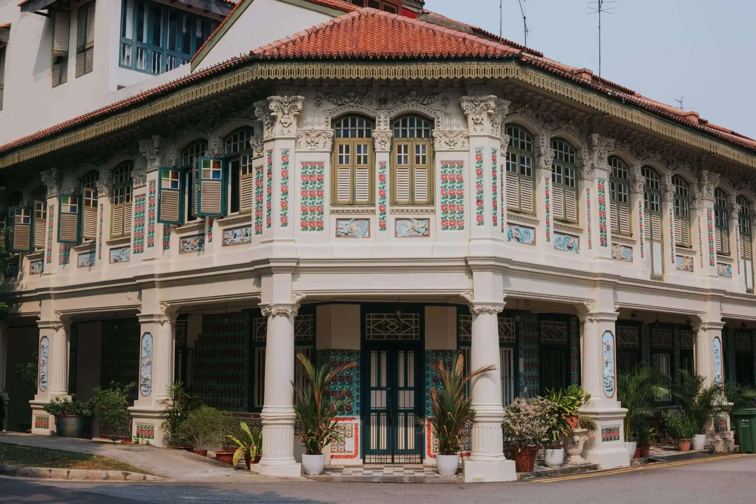
Why are shophouses the most underrated properties in Singapore
Thinking of chucking that cookie-cutter condo? Interested in the shophouse living experience? Here’s 5 reasons why renters are choosing shophouses over condos.

A Local’s Guide to
Co-living in Singapore – 2026
Curious about co-living but not sure where to begin? Imagine stepping out of your bedroom into a community of like-minded people, ensconced in beautiful surroundings.
A Local’s Guide To Short Term Accommodation in Singapore – 2026
Looking for the best short term accommodation in Singapore and not sure where to begin? Let us help find the perfect short term stay for you.

Comments